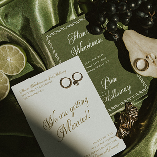


Choosing Your Color Scheme
Fretting about finding the perfect color combo for your wedding? Your color palette will set the tone and will be front and center all day. Featured in the flowers, décor, bridesmaid dresses and other details—your perfect color palette should showcase your personality, mood and unique flair.
If you really are in love with one color—this is a great way to do that while incorporating in similar hues for all wedding day details. Using slightly different shades or keeping everything at the exact hue when coordinating your décor is important. Mixing textures and patterns of fabrics and using different varieties of flowers adds flair to this color palette. If you want to maintain a cohesive and elegant feel of your wedding day, a gorgeous monochromatic scheme is perfect.
If you don’t have a color scheme in mind yet, simply choose one color to begin with and leave the rest up to the color wheel to create the perfect combo. This could be your favorite color, a color that evokes an emotion, or that’s even tied to a favorite location. Whether you’re going for a romantic, rustic or a calming feel, or want to be reminded of the ocean, mountains or city scene—the options are endless!
Monochromatic Color Schemes
Harmonious Color Schemes
Bold Color Schemes
Vibrant Color Schemes
Neutral Color Schemes
Spring Color Schemes
Summer Color Schemes
Fall Color Schemes
Winter Color Schemes

 Monochromatic Color Scheme
Create a clean, subdued palette by choosing colors that are shades and tints of the same hue.
And remember, you don’t need several colors to have a gorgeous palette. Don’t feel limited to two colors {we recommend no more than five colors}. Check out these color schemes to be inspired—your dazzling day will no doubt have the most wondrous color palette.


 Harmonious Color Scheme
Enrich a harmonious palette by using analogous, adjacent colors on the color wheel.
While combining two or three colors next to each other on the color wheel, these make for great color palettes. As the name implies, they are pleasing to the eye and tie the overall tone of your wedding day together. It’s important here to keep the tones the same. For instance a pale pastel pink next to a bold bright blue would not fare well in a harmonious scheme. From a beach wedding with bright greens and teals to a garden wedding with soft yellows and peaches—bring sweet harmony to your wedding with this color scheme.


 Bold Color Scheme
Stand out with maximum contrast by choosing complementary colors that are opposite one another on the color wheel.
Infuse any wedding with a festive, celebratory energy by going with a bold color scheme. While bold colors are sure to stand out against your wedding dress, they will also really pop in your photos. Having both warm and cool colors creates a strong lasting impression and is still pleasing to the eye—and can be very fun, yet glamorous. A complementary color scheme is great for wedding centered around holidays, summer, favorite sports teams—or really for anyone who just loves a lot of color!


 Vibrant Color Scheme
Vibrant balance is achieved when you choose three colors equally positioned on the color wheel—a triad scheme.
For a wedding that’s colorful and yet balanced, a vibrant triad color scheme may be the way to go. This scheme provides the right visual contrast, yet maintains a kind of unique harmony. Although they do not provide as much contrast as a complementary scheme, it still retains balance, making the colors look vibrantly rich. To get the right visual effect for your big day, one of the colors should be used extensively, while the other two should be used only as accents.


 Neutral Color Scheme
Simply put, this means without color. Neutral colors result from the combination of two complementary colors and include variations of black, white gray and brown.
Couples looking for a very fresh, sophisticated and elegant feel to their wedding typically start with a neutral color palette. Muted neutrals with hints of grey metallics offer a classic timeless look, while ivory and black are great for formal weddings. Shades of greens can also stand as neutrals, as they are connected to nature. Since a neutral palette is natural and unfussy, it fits into just about any style wedding, including even rustic or vintage garden weddings.


Spring Color Schemes
With spring comes renewal, new life and awakening! From pretty pastels to bright greens, pinks and blues, spring wedding color themes can be (quite literally) anything under the sun. The changing of seasons brings brighter tones and soft pastels. Pairing a pastel shade with a vibrant hue such as yellow is sweet, while choosing colors that remind us of Easter eggs or blooming wildflowers can make the decision easy yet classy. Dark, rich colors are typically not associated with spring, so it’s best to keep colors light and airy. From complementary colors to neutrals, the palette options are endless!


Summer Color Schemes
Summer weddings are full of freshness, happiness and sunshine; and so should your color palette! Summer colors are easy to pick, if you just look around you. From bright, lively warm colors of citrus fruits to bright splashy blues that may remind you of the ocean—the vibrant palette options are why many couples choose to marry in the summer months. If you’re not so much into bright tones, neutrals are gorgeous when paired with bright accents of turquoise, green, pink or peach tones. Summer color palettes really suit weddings of all types! From rustic weddings in the countryside to seaside affairs, summer color combos are very chic and fun!


Fall Color Schemes
The cooler weather and turning leaves of fall bring jewel tones and warm colors into play. Many couple choose a fall wedding for the richness, warmth and texture of details that bring their day together. Like any season, fall color palettes are inspired by elements of nature. Palettes don’t have to be the typical browns, oranges and reds many might associate with fall—there is plenty of room to incorporate glamorous purples, fuchsias and metallics. With the beautiful fall colors in full swing, sweet combos of blush and pinks also work perfectly for a shabby chic or whimsical feel.


Winter Color Schemes
Winter palettes are all about mixing unexpected seasonal elements with elegant neutral details and a hint of sparkle and sequins. Pretty jewel tones are also especially popular this time of year, with the festivity they bring to the cooler months—when couples are looking for rich, warm colors to enliven their big day. More classic winter palettes include bold reds and shades of ivory, pale pinks and greens. Not feeling the classic look? Go for brighter jewel tones with cool neutrals to add a pop of color to your day! Modern greys with mixtures of bright cheery berry tones can also add a lot of glamour to color palettes.


Wedding Planning Tools
Planning the perfect wedding stationery can be exciting, fun—and maybe even a bit stressful. But it doesn’t have to be with the help of our Wedding Planning Tools.